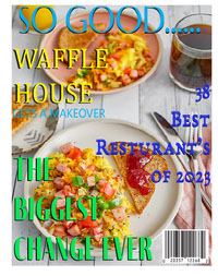
This magazine cover was originally designed for a portfolio assignment. This project consisted of giving a company a new look; making sure the company gives off a different feel and look than before. This was a project that revolved around communication and how the community perceives Waffle House. I decided to take the idea of Waffle House being looked at as negatively; and attempted to change the over all feel and look. This project also consisted of changing the logo of the company as well. The logo would be changed from yellow and black to a more modern and darker tone theme.